
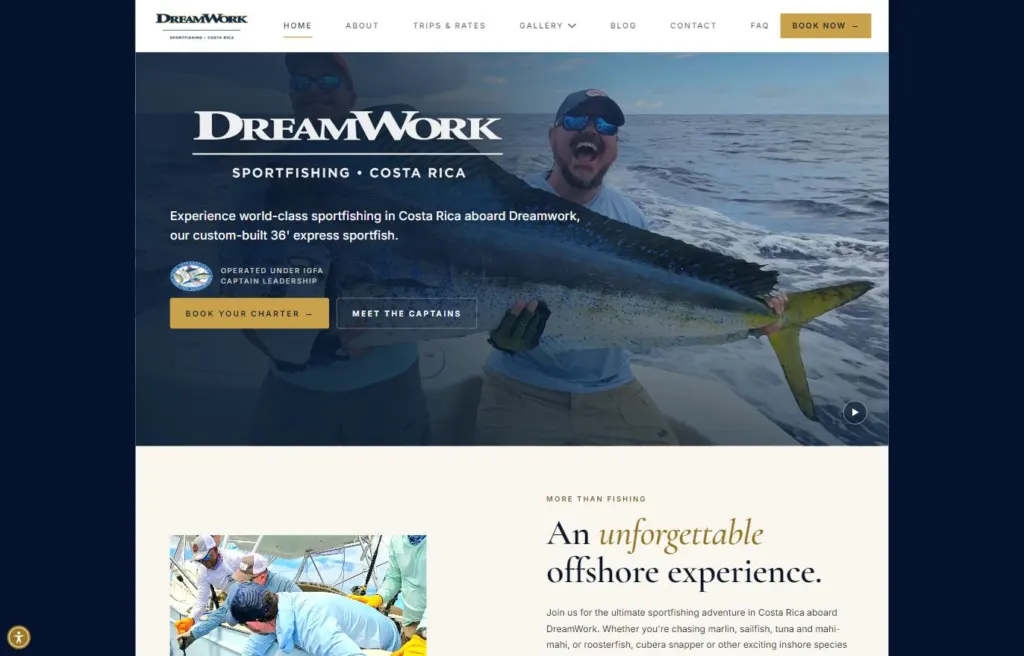
Luxury fishing charters
DreamWork Sportfishing
A luxury Costa Rica charter site, with package comparisons, a trip-report blog and local SEO.
Nonprofit
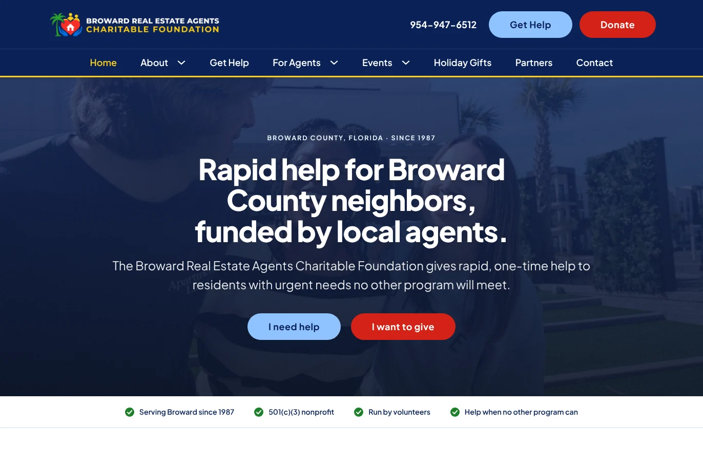
The Broward Real Estate Agents Charitable Foundation has given rapid, one-time help to Broward County residents since 1987, funded by local real estate agents. Its old website was a single template page with dead-end links, so I rebuilt it from the ground up on WordPress: a clear front door for people in a crisis, online giving that takes about a minute, and a page built around the way agents actually give, at the closing table.
Client
Broward Real Estate Agents Charitable Foundation
Location
Broward County, Florida
Launched
2026
Services
Accessibility, Bricks Development, Web Design
Stack
WordPress, custom design system, custom giving and application forms
Before & after
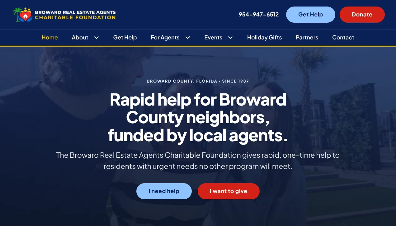
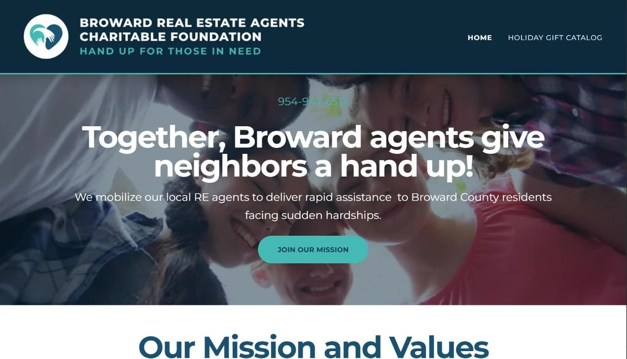
Drag the slider to compare. The old homepage had two menu items and a single button, and that button just opened an email draft. The redesign says exactly what the foundation does in the headline, keeps the phone number, Get Help and Donate in the header on every page, and gives every visitor two clear next steps.
Highlight 01
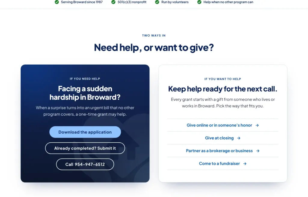
Right below the headline, the homepage asks one question: do you need help, or do you want to give? Someone facing a sudden hardship can download the application, submit a finished one or call. Supporters see every way to give, from online gifts to closing gifts and fundraisers. Trust markers, like serving Broward since 1987 and being run by volunteers, sit right under the hero.
Highlight 02
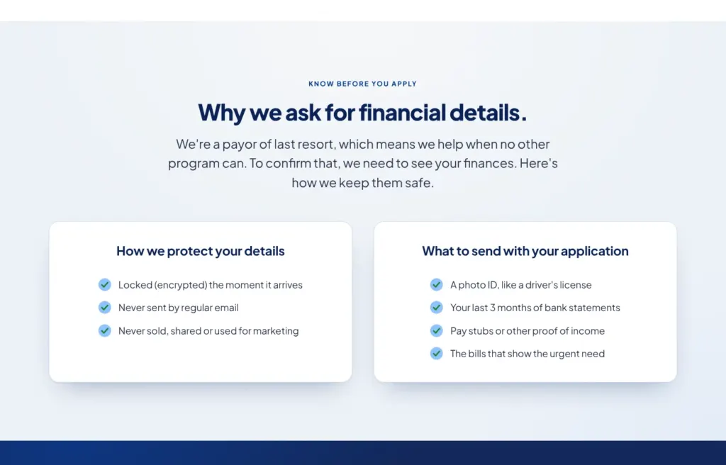
The Get Help page is written for someone stressed and short on time. It explains who qualifies in three simple checks, why the foundation needs financial details, exactly which documents to send and how those details are protected. Applicants download the application, then upload it with their documents right on the page instead of emailing sensitive files. A short FAQ answers the big questions, like whether the help is a loan.
Highlight 03
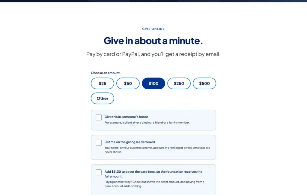
Donors stay on the foundation’s own site with a fast, friendly form. Tap an amount or enter your own, give in someone’s honor (a nice touch for a client after a closing), join a giving leaderboard that never shows amounts, and cover the card fees with one checkbox so the foundation receives the full gift. Checks, closing gifts, office drives and events are all laid out right below.
Highlight 04
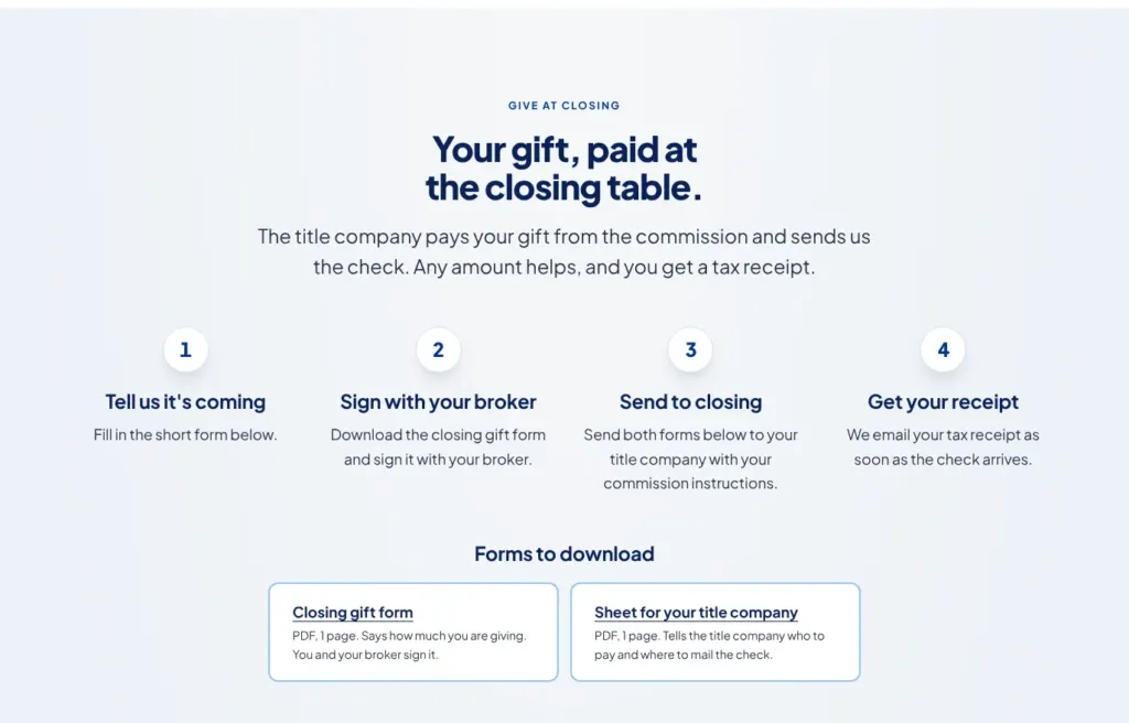
Real estate agents are the foundation’s biggest supporters, so they got a page built around how they already work. Giving at closing takes four steps, with both forms ready to download: one to sign with your broker and one for the title company. A short online form lets the foundation know a gift is coming, so it can watch for the check and send the receipt. Agents can also give in a client’s name or refer someone who needs help.
Goal
The foundation does urgent, real work: car repairs for a family, hearing aids for a sick child, help after a house fire. Its old website didn’t show any of that. Everything lived on one template page with two menu items, several cards looked clickable but went nowhere, the donate button sent people off the site, and someone in a crisis had to fill out a form just to ask for an application.
The new site had to work for two very different visitors at once: a neighbor having the worst week of their life, and a supporter, usually a local real estate agent, who wants to give. It also had to be easy for a small, all-volunteer team to run and comfortable for older visitors.
Approach
I started with structure. One page became eleven focused pages, each built around a single job: get help, donate, give as an agent, partner as a business, learn the foundation’s story or find an event. The homepage asks one question right after the headline, need help or want to give, and sends each visitor down the right path.
The foundation had just chosen a new logo and wanted the website to feel like it belonged with it. I themed the site to match, balancing boldness with professionalism: deep navy, one strong red for giving actions and the logo’s yellow used carefully as an accent, with big, confident headlines and photos of people instead of houses and keys. Every color, size and spacing value comes from a shared design system, so the site stays consistent as it grows.
I wrote the copy in plain, short sentences for people under stress, and built the site to the WCAG 2.2 AA standard: strong contrast, large tap targets, full keyboard support, labeled form fields and nothing that moves or flashes on its own. A visible Home link and the phone number on every page help visitors who aren’t confident online.
Results
The finished site gives the foundation:
The receipts
Google PageSpeed Insights, mobile, tested November 2026.
99
out of 100Performance
100
out of 100Accessibility
96
out of 100Best Practices
100
out of 100SEO
More work
Luxury fishing charters
A luxury Costa Rica charter site, with package comparisons, a trip-report blog and local SEO.
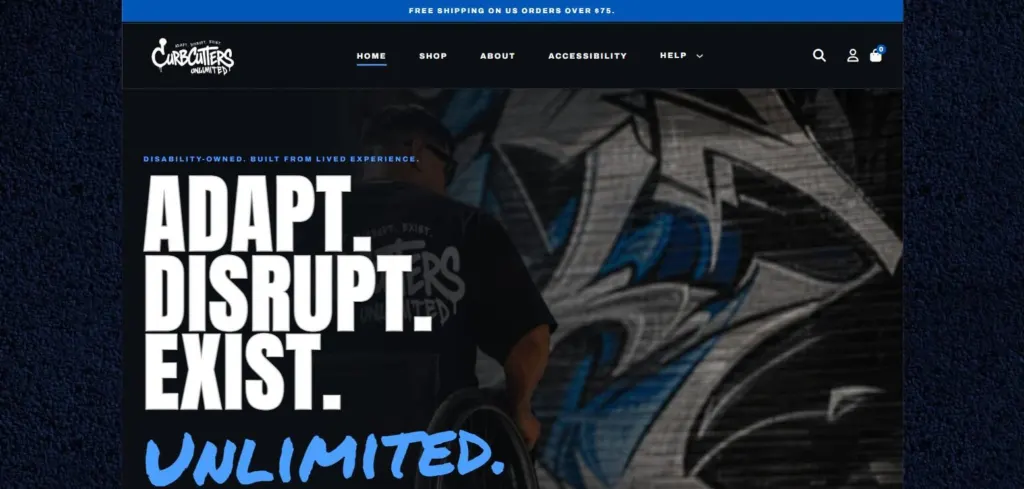
Streetwear e-commerce
My own disability-owned streetwear brand: a WordPress store tested with keyboards and screen readers from product page to checkout.
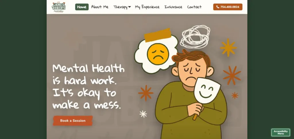
Mental health practice
My own Florida telehealth therapy practice, with a site that feels human and handles privacy carefully.