
Logo & wordmark
Primary, secondary and icon versions, delivered as vectors.
Service
Logos, color, type and the rules that tie them together, designed to work on screens first and everywhere else after.
The problem
What people remember is consistency: the same colors, type and tone everywhere they meet you. Without a system, every new flyer and social post drifts a little further off-brand.
I design identities as systems, then build them straight into your website’s design tokens, so the brand and the site never disagree.
What's included
Primary, secondary and icon versions, delivered as vectors.
Tested for contrast and accessibility from the start.
Type pairings that work on screens and in print.
A short, clear guide anyone on your team can follow.
Business cards, letterhead and social templates.
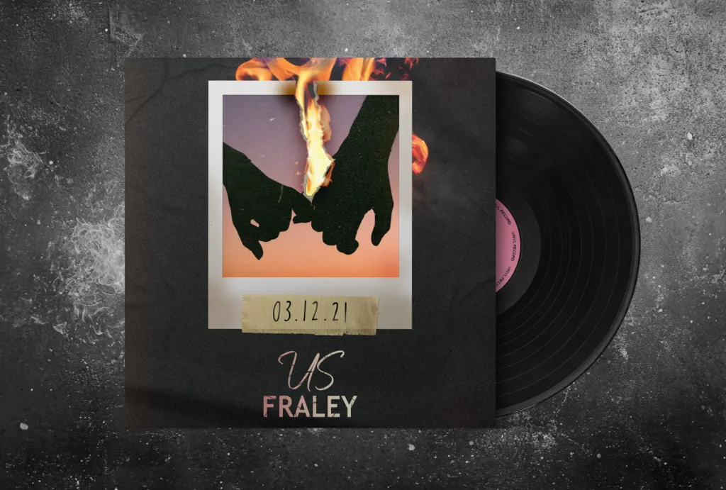
Single and album artwork, like the covers for Fraley.
How it runs
Who you are, who you're for and what the brand has to say.
A focused set of directions, each with the reasoning behind it.
One direction, sharpened until it works at every size.
Files, colors, type and a guide, ready to use.
Related work
Music
Single cover art for Fraley’s “Us”: a burning Polaroid for a song about a breakup.

Music
Single cover art for Fraley’s “Blame”: distressed type over a dark pine forest.
FAQ
Enough to show real options, not a slot machine. Each concept comes with the thinking behind it.
Vector and web formats, color and one-color versions, and a short guide on how to use them.
Often that’s the smarter move: keep what people recognize, fix what doesn’t work.
Yes: business cards, letterhead, flyers and presentation decks.