
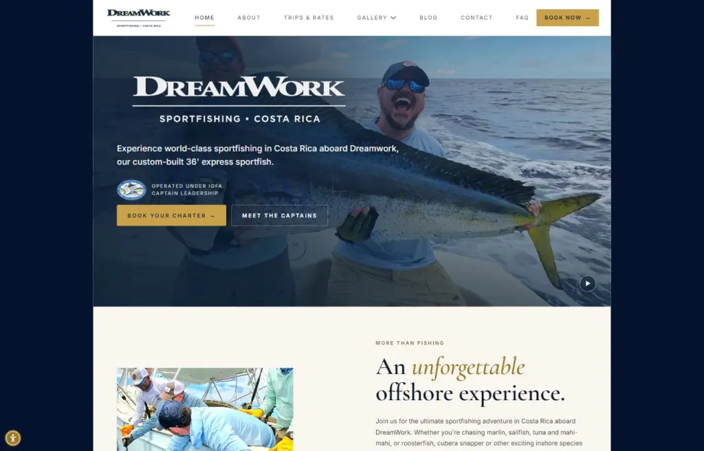
Luxury fishing charters
DreamWork Sportfishing
A luxury Costa Rica charter site in Bricks, with package comparisons, a trip-report blog and local SEO.
Fishing charters
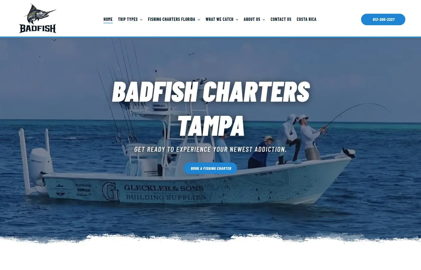
Badfish Charters is a Tampa Bay fishing charter running inshore, nearshore, tarpon and goliath grouper trips from Tampa down to Siesta Key. The site already lived on Duda, so instead of starting over, I modernized it in place: reorganizing the content around how anglers actually search, tightening the SEO structure, and rebuilding the CSS from the ground up as a tokenized system that gives the brand a bold, consistent look on every page.
Client
Badfish Charters
Location
Tampa Bay, Florida
Launched
2026
Services
SEO, Web Design
Stack
Duda, custom tokenized CSS, structured data
Highlight 01
I did a full CSS rework and replaced one-off styling with a set of design tokens: ink, navy and Badfish blue for color, Barlow Condensed for headings, shared spacing values for sections, stacks and cards, and reusable textures like grit and torn-paper edges. Duda’s global color palette was mapped to the same navy and blue, so the site editor and the custom CSS stay in sync. Every component pulls from those tokens, which keeps the brand consistent and turns future style changes into a single edit instead of a page-by-page hunt.
Highlight 02
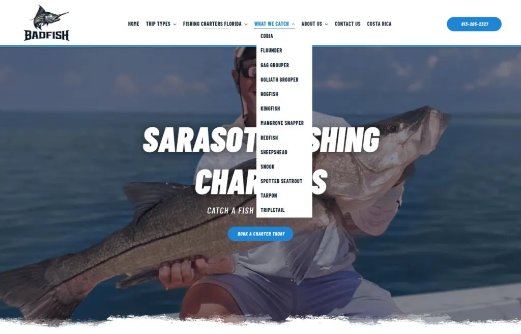
The navigation is organized into clear groups that match how people shop for a charter: by trip type (inshore, nearshore, tarpon and goliath grouper), by location (seven pages from Tampa and Ruskin down to Sarasota and Siesta Key), and by species (13 guides from cobia to tripletail). Visitors can reach the right trip in one or two clicks, and every page has a clear place in the site structure.
Highlight 03
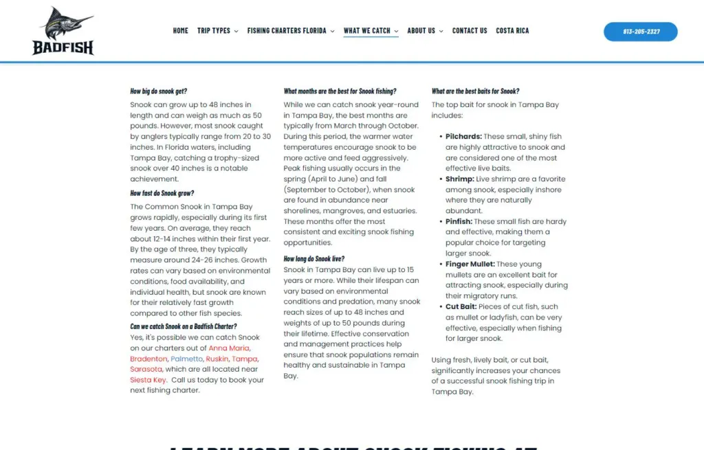
Species and location pages are structured around the questions anglers actually type into Google, like how big snook get, the best months to fish and the best baits to use. Each guide links out to the location pages and back to booking, building a tight internal linking network. Local business and breadcrumb structured data help search engines understand the business, its service area and how the pages fit together.
Highlight 04
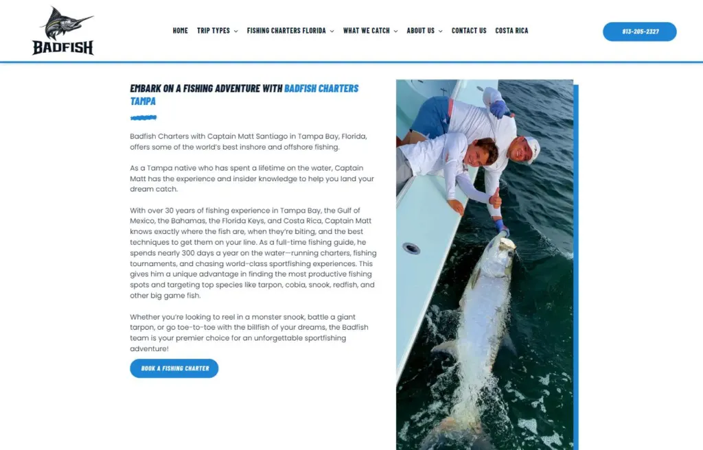
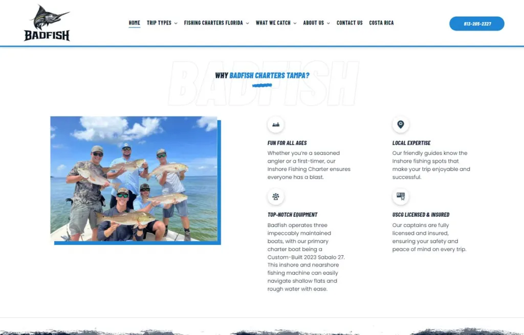
The Badfish look is built from a handful of repeatable details: torn-paper section dividers, outlined Badfish watermarks behind headings, square photos with an offset blue accent block, bold condensed italic headings and uniform rounded buttons. Because each detail is defined once in the token system, it shows up the same way on the homepage, trip pages, location pages and species guides, so the brand looks the same wherever you land.
Goal
Badfish needed a site that looked as bold as the fishing and was easier to find in search, without the cost and downtime of a full rebuild. The goals were to organize a growing collection of trip, location and species pages into a structure that made sense to visitors and search engines, and to replace scattered, inconsistent styling with a system that keeps the brand consistent and easy to maintain.
Approach
I started with the site’s organization, grouping pages by trip type, location and species and shaping the navigation to match. From there I tightened on-page SEO with question-based headings, internal links between species and location pages, and structured data for the local business and breadcrumbs. Finally, I rewrote the site’s CSS as a tokenized system on top of Duda, defining colors, typography, spacing and brand textures once and applying them everywhere, so the site stays easy to edit in Duda’s builder without breaking the look.
Results
The modernized site delivers:
Badfish now has a site that looks like the brand and is built to keep growing.
More work
Luxury fishing charters
A luxury Costa Rica charter site in Bricks, with package comparisons, a trip-report blog and local SEO.
Streetwear e-commerce
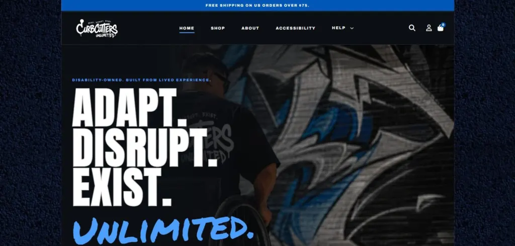
A disability-owned streetwear store in WooCommerce, tested with keyboards and screen readers from product page to checkout.
Mental health practice
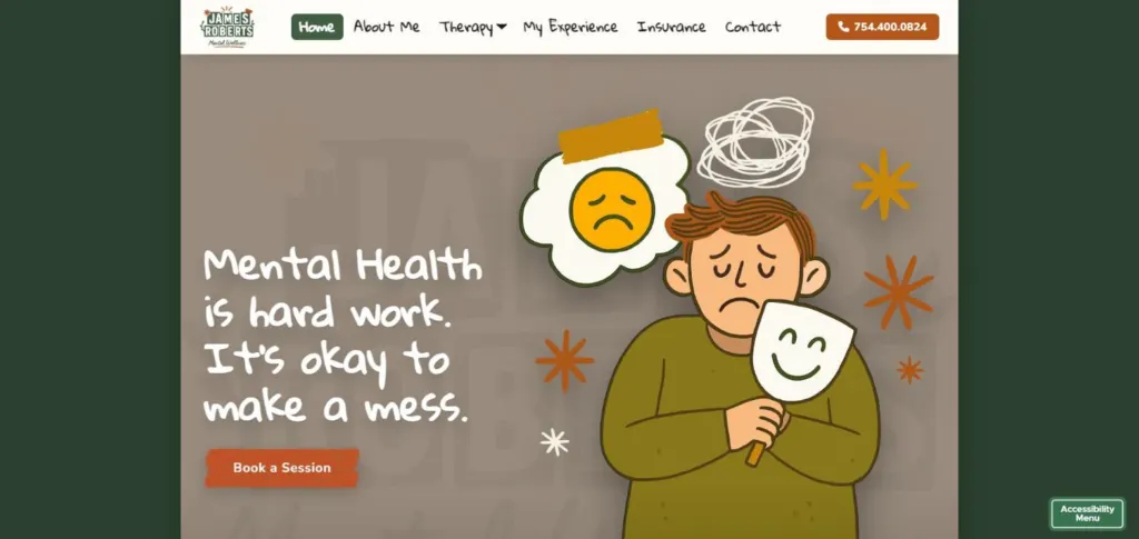
A Florida telehealth therapy practice site that feels human and handles privacy carefully.